
Written by Aashish Khatri, Indian Institute of Information Technology Gwalior and Summer 2023 Mentee
As a UI/UX developer, I have always been fascinated by the intersection of design and technology. From the very beginning of my career, I was driven by the desire to create user-centric experiences that seamlessly blend aesthetics and functionality. This blog is an account of my mentorship journey as a UI/UX developer at Open Mainframe Project’s Software Discovery Tool team with Elizabeth Joseph and Arsh Pratap Singh as mentors and my fellow mentee Prince handling the backend side, highlighting the challenges, triumphs, and the valuable lessons I’ve learned along the way.

Aashish Khatri
Embarking on the Path:
My journey began with a deep curiosity for understanding user needs and an eagerness to learn from experienced designers. Collaborating with my team and seeking feedback became integral parts of my growth. I quickly realised that being open to constructive criticism allowed me to continuously improve my skills and push the boundaries of my creativity.
In the ever-evolving landscape of UI/UX design, continuous improvement is key. I embraced the importance of staying adaptable, learning new tools, and understanding the latest design methodologies. By staying curious and exploring new avenues, I was able to expand my skill set and bring fresh perspectives to my work.
At the start of my mentorship, I learned by watching different experts like Ran Segall and Pablo Stanley, understood the proper UI/UX lifecycle, from creating wireframes to setting proper layouts, typography, colour schemes and visual elements helped me establish a strong framework.
During my initial phase of research nothing was clear, what types of font setting, the structure and layout, the use of different props. It was a blank canvas.
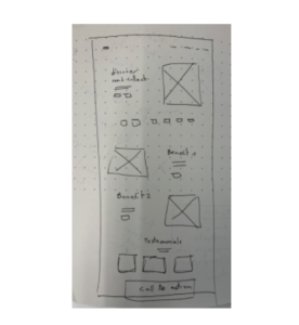
Wireframe:
I started looking at different package managers, how they function and started tossing ideas, first creating a wireframe for our new website. I wanted to create a seamless and intuitive user experience, ensuring that users could easily navigate through the package manager. These visual representations allowed me to visualise the flow of the application and test different design solutions.
Wireframe design:
Designing the User-Interface:
Throughout the development process, I embraced an iterative design approach.Regular communication and collaboration helped bridge the gap between design and development. This collaboration also allowed for the seamless integration of design elements and functionalities into the application. By following the brand guidelines and incorporating a clean and modern design aesthetic, I was able to create an appealing and professional user interface.
Starting with the mock-ups, Taking inspiration from our old website, I started creating the hero section of our landing page, first with the ambition of our project and the functionality being displayed at the front. Going through different layout settings, I struggled a lot with the container behaviour with respect to the changes in size, as this was my first experience of
professional UI designing with figma, I had to learn how to use and harness the true power of the tool. Learned the correct way to build layout, from creating a proper frame to defining the constraints and container behaviour(hug, fill and fixed), first everything was static, then gradually I understood the process and everything came along nicely.
First Challenge:
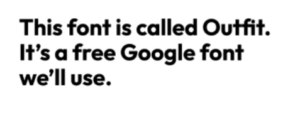
Typography:
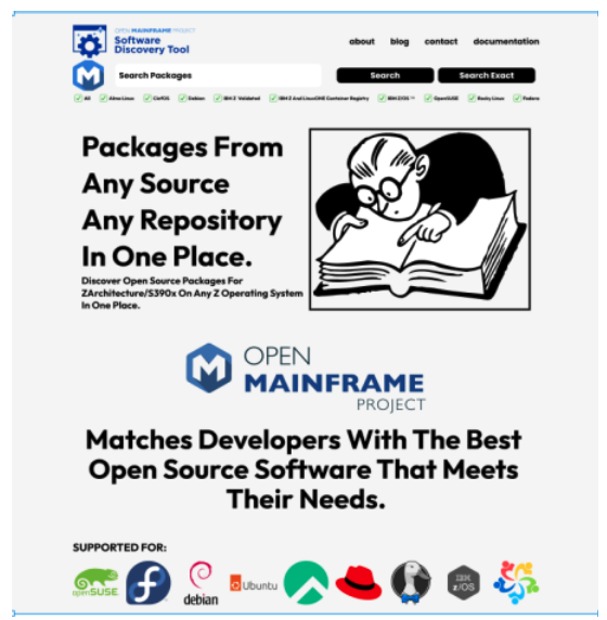
Outfit/Helvetica were the choices I finalised for the representation of our website. And Zilla Slab as the second alternative.
Created the font family variables for the CSS files, with three sets, Heading, SubHeading, Body texts, sizes, line-heights and alignment that would be used throughout the website.
Colour Schemes:
The theme I sorted for the website was grey/ navy contrast, as the images and our Software discovery tool and open mainframe Logo were complementing the colour scheme. After finalising just monotonic grey, it suits better with the subtle theme of our tool.

Visual Elements:
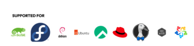
Our website gives search power for different Z/OS and Linux sources, So the compatibility should be presented when the user is visiting the website. Apart from the filter checkboxes, the array of logos of different Operating Systems( hyperlinked to their respective sections in the documentation of our website) at the bottom of the middle section was the idea we tossed during our initial phase.
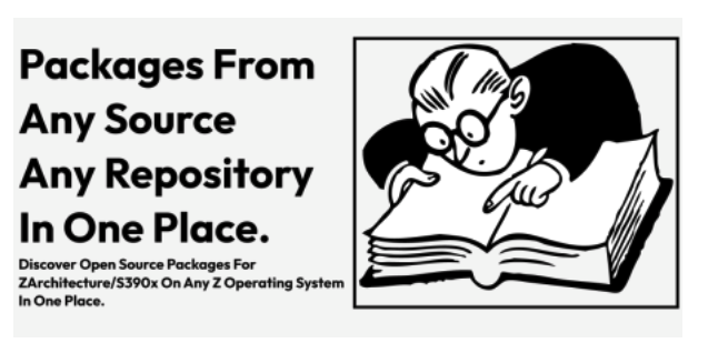
Another visual element was the theme image, after finding a royalty- free illustration from pixabay, it was witty and light, we thought this would sit in nicely.
Putting it All Together:
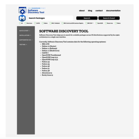
Landing Page:
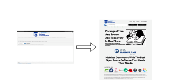
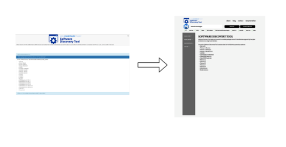
Transition (Old to New):
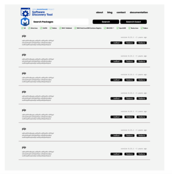
Search Page:
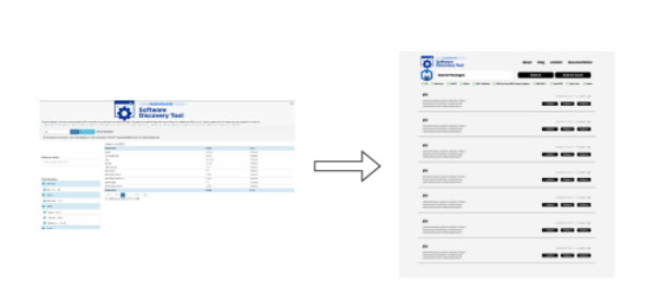
Transition (Old to New):
Documentation Page:
Transition (Old to New):
From Mockups to Frontend:
During the designing process, on the side we also started the work on implementing the new frontend for our website, as the goal for our mentorship was to redesign the frontend to new React based framework and shift our backend to MariaDB. Now this is the part where I faced some challenges, as mentioned in the design process, initially I hard coded static layouts with no flexibility, the result – the website looked really bad with no responsiveness. Now first I learned the dynamic auto layout, css grid and flexbox. Then after getting a proper grip, finally the components were behaving the way we wanted. After setting up the components, Searchbar was the next step, for filtering sources, dropdown was the first idea tossed around, then after not aligning properly, checkboxes were finalised. After the design was the functionality part, the search page was the next destination, mockups made it easy to write the code, as it serves as a good boilerplate. After designing the search components and the documentation route, the frontend was integrated with the backend, the packages were fetched through rest API, and the speed thanks to Prince and our mentors great work with the MariaDB SQL database, was blazing fast, the tens of thousands packages were served in seconds. Yet the frontend is not ready to be integrated because of the pagination and filtered search functionality still yet to be implemented correctly.
Conclusion:
My journey as a Frontend developer has been a thrilling adventure filled with constant learning, growth, and the satisfaction of creating exceptional user experiences. From understanding user needs to collaborating with multidisciplinary teams, and continuously improving my skills, every step has brought me closer to my goal of crafting meaningful and delightful digital experiences. This mentorship was a great roller coaster ride for me, although I couldn’t complete my goals of mentorship, I would still be working after the tenure to ensure the project gets to the new phase. Reasons being focusing on relatively trivial problems that could have been tackled later. I learned so many things from the experience. Finally I’m grateful to have such a supporting and patient team who were with me along the journey. Through gaining real-world experience, and collaborating with professionals, I acquired invaluable skills and knowledge that will shape my career.
Links:
Here’s the link of our draft pr and UI mock-ups and prototypes:
- UI Prototype: https://www.figma.com/file/honJeXgg8gj24IudSlQSNf/lfx-mockup?type=design&node-id=0-1 &mode=design&t=q0I0U1H06Yiwdffn-0
- Frontend Code (Draft PR): https://github.com/openmainframeproject/software-discovery-tool/pull/163